Tag

PHOTOGRAPHY

Browsing
Photo courtesy of potzuyoko

In our interview on Monday, professional photographer Sally Wiener Grotta talked about using histograms to help determine the exposure she needs to best reflect her subject in a photograph. If you took any statistics in high school or college — or have helped a middle schooler with her math homework — you may know exactly what a histogram is. But do you understand how these graphs are helpful for photography?

In short, a histogram is a graph that demonstrates variance and frequency.  (Stay with me here. I know there are some strange, mathy words in there.) Here’s a really simple example:

The administrators of a health clinic are collecting data about the patients, so that they can provide the most appropriate services.  The histogram below shows the ages of the patients.

Even with one quick glance, it’s apparent that the clinic sees far fewer patients who are between 80 and 90 years old. In fact, it looks like the group that’s most represented includes those between 40 and 50 years old.

(If you’re really being a smarty pants, you might notice that the histogram follows the normal or bell curve. But you don’t have to know that to get along in everyday life — unless you work in statistical analysis.)

So here’s what’s special about a histogram:

1. The horizontal line (or axis) represents the categories (or bins). These are almost always numbers, and each one has no gaps. In other words, in a histogram, you won’t have categorical data, like people’s names. Notice also that the data is continuous. Someone who is 43 and 5 months falls in the 40-50 year old category.

2. The vertical line (or axis) represents the frequency or count of each category.  These are always numbers. So in the histogram above, 40 people who visited the clinic were between 80 and 90 years old.

3.  The bars of the histogram butt up against one another. That demonstrates the fact that there are no gaps in the data and the data is numerical.

4. The taller the bar, the more values there are in that category. The shorter the bar, the fewer values there are in that category.

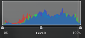
So let’s look at a photographer’s histogram:

First off, these histograms are automatically generated by imaging software or even some fancy-schmancy cameras. In other words, technology plots these values. It’s the photographer’s job to interpret them.

You probably noticed that there are no numbers on this histogram.  Like a statistical histogram, the vertical axis represents frequency.  But the horizontal axis doesn’t represent numbers. Instead, it shows shades.  Follow the bar at the bottom of the histogram from the left to the right.  Notice how it goes from black to grey to white? In fact, the bar gradually changes from black to white.

If you could blow up this histogram to a much larger size, you would see that it’s made up of lots and lots of skinny rectangles. These represent the number of pixels in the photograph that are each shade. So there are very few (if any) pure white pixels. There are some pure black pixels, but not as many as there are grey ones.

By glancing at this image, an experienced photographer can determine whether an image needs more or less exposure. There’s a great deal of artistry in this — a really dark photo can have a dramatic effect, while certain conditions require more exposure than others.

There you have it. Histograms aren’t just for statisticians. And those silly little graphs you drew in your middle school math class actually have artistic value!

Do you have questions about histograms? Ask them in the comments section!

Photography is one of those art forms that looks easy but is really challenging — at least challenging to get it done right!  Writer and photojournalist, Sally Wiener Grotta describes how math helps her compose the best photograph, including perfect lighting. 

Can you explain what you do for a living?

Essentially, I am a visual and verbal storyteller. This has developed into a multi-pronged career.

As a photojournalist, I have traveled all over the globe, visiting all 7 continents (including Antarctica several times) and many islands (such as Papua New Guinea and Madagascar) on assignment for major magazines and other publications. My current and ongoing fine art project is American Hands (www.facebook.com/AmericanHands) for which I am creating narrative portraits of individuals who are keeping the old trades alive, such as a blacksmith, glassblower, bookbinder, spinner, weaver, etc.  I travel around the county, mounting American Hands exhibits and giving presentations about the people I photograph.

In addition, I give lectures and teach master classes on photography and imaging. I recently launched a YouTube channel in which fellow photographer David Saffir and I discuss the essential elements that define a photograph and pull us into it, using the narrative power of shadow and light.

As a non-fiction writer, I have written literally thousands of articles, columns, features and reviews for major magazines, newspapers and websites, as well as seven non-fiction books. In non-fiction, I am primarily known for my expertise in testing, analyzing and explaining technology related to photography, imaging, printing and epublishing.

My first novel “Jo Joe” will be published this spring as both an eBook and printed book by Pixel Hall Press, followed later this year with other stories and books.

When do you use basic math in your job?

Math is integral to my work in many ways. An intuitive understanding of geometry is essential for good photographic composition. In addition, I use math to control exposure (the amount of light used to define a photograph) and to decide how to set up auxiliary lighting.

A prime example of math in photography and imaging is the histogram tool. The histogram is a graph that provides information analyzing the exposure of a photograph. When a photographer or digital artist looks at a histogram, it helps us understand the “dynamic range” of the picture. In other words, what percentage of the photograph is made up of highlights, shadows and midtones. If the graph displays that there is too much image data in, say, the highlights, and I know that the image is of a scene that isn’t that bright, I can then decide to change my exposure so the photo better represents the scene.

But basic math goes much deeper into my everyday career concerns. For instance, my American Hands project is a non-profit venture supported by grants and sponsors. When I apply for a grant, I must present an accurate, logical and meaningful balanced budget. Therefore, I have to calculate my costs over time and balance that against potential income. (If the budget isn’t balanced with income=costs, the grant application will be rejected.)

Another example of everyday math has to do with laying out books and journals for publication, such as my American Hands Journal. At the very basic, a typical book is printed in “signatures” of a specific number of pages each, such as 4-pages each. So a book must be laid out so that its total pages are a multiple of 4 (or whatever the signature number is). Then, there are spatial concerns, such as keeping type and photographs within specific printable margins, that requires more intuitive understanding of geometry.

Do you use any technology to help with this math?

I do believe that it is important to understand math and be able to do it without calculators or computers. However, when I use it for accounting, grants applications and such, I must be sure that I haven’t introduced an error, through a mistake in arithmetic or simply a typo. So, I may use a calculator. More often, I will use Microsoft Excel on my computer to create a spreadsheet that does automatic calculations for me when I input figures. However, I am the one who creates the rules for those calculations. So, using a spreadsheet doesn’t preclude the need to understand the underlying math.

How do you think math helps you do your job better?

Math isn’t only necessary in my career as an artist and writer, but it is also a skill that sharpens your mind the more you use it. That kind of precision thinking is a great complement to the creative side of my business, balancing it. What’s more, a sharpened mind is one that is more open and creative.

How comfortable with math do you feel?

I was lucky to have some wonderful teachers – starting with my mother before I ever went to school. She created basic arithmetic puzzles to keep me busy, and I learned to think of numbers as a game, starting when I was about 4 years old. So, I have long been comfortable with numbers and their relationships to each other. Math and art are not opposites. In fact, in the Renaissance, the great mathematicians were artists and vice versa. And, today, the great math innovators have highly creative minds.

What kind of math did you take in high school?

I studied geometry, algebra and calculus in high school.  I enjoyed it, again, mostly because I had good teachers. It continued to be a game to me to understand how numbers fit and changed each other.

Did you have to learn new skills in order to do the math you use in your job?

The new skills I developed since leaving school has to do with defining intelligent, useful calculation rules in an Excel spreadsheet. But it was all based on math I already understood, so it was relatively easy… once I understood how the spreadsheet works.

Do you have questions for Sally?  Ask them in the comments section!