You know when you were little and you got sick on your birthday? It’s not quite the same thing, but I was down and out yesterday — on Pi Day! (I didn’t even get to wear my “cool” Pi sweatshirt.) So I bring you these little tidbits a day late.
What’s Pi Day, you ask? Flip back to yesterday’s calendar: March 14 or 3-14. Now think about the estimation of π or pi: 3.14. Ta-da!
Here are a few ways folks have celebrated Pi Day, thanks to the watchful eyes of my wonderful Math for Grownups readers.
Amherst College, 2004: “On March 14, or 3.14, students celebrated National Pi day by waking up at 6 a.m. and burning through 15 sticks of sidewalk chalk. Here, digits of pi trail off in front of Fayerweather Hall on National Pi Day. 2,010 digits of pi stretched from Valentine Dining Hall to Merrill Science Center.”
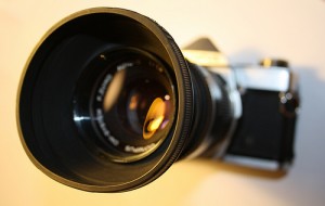
In our interview on Monday, professional photographer Sally Wiener Grotta talked about using histograms to help determine the exposure she needs to best reflect her subject in a photograph. If you took any statistics in high school or college — or have helped a middle schooler with her math homework — you may know exactly what a histogram is. But do you understand how these graphs are helpful for photography?
In short, a histogram is a graph that demonstrates variance and frequency. (Stay with me here. I know there are some strange, mathy words in there.) Here’s a really simple example:
The administrators of a health clinic are collecting data about the patients, so that they can provide the most appropriate services. The histogram below shows the ages of the patients.
Even with one quick glance, it’s apparent that the clinic sees far fewer patients who are between 80 and 90 years old. In fact, it looks like the group that’s most represented includes those between 40 and 50 years old.
(If you’re really being a smarty pants, you might notice that the histogram follows the normal or bell curve. But you don’t have to know that to get along in everyday life — unless you work in statistical analysis.)
So here’s what’s special about a histogram:
1. The horizontal line (or axis) represents the categories (or bins). These are almost always numbers, and each one has no gaps. In other words, in a histogram, you won’t have categorical data, like people’s names. Notice also that the data is continuous. Someone who is 43 and 5 months falls in the 40-50 year old category.
2. The vertical line (or axis) represents the frequency or count of each category. These are always numbers. So in the histogram above, 40 people who visited the clinic were between 80 and 90 years old.
3. The bars of the histogram butt up against one another. That demonstrates the fact that there are no gaps in the data and the data is numerical.
4. The taller the bar, the more values there are in that category. The shorter the bar, the fewer values there are in that category.
So let’s look at a photographer’s histogram:
First off, these histograms are automatically generated by imaging software or even some fancy-schmancy cameras. In other words, technology plots these values. It’s the photographer’s job to interpret them.
You probably noticed that there are no numbers on this histogram. Like a statistical histogram, the vertical axis represents frequency. But the horizontal axis doesn’t represent numbers. Instead, it shows shades. Follow the bar at the bottom of the histogram from the left to the right. Notice how it goes from black to grey to white? In fact, the bar gradually changes from black to white.
If you could blow up this histogram to a much larger size, you would see that it’s made up of lots and lots of skinny rectangles. These represent the number of pixels in the photograph that are each shade. So there are very few (if any) pure white pixels. There are some pure black pixels, but not as many as there are grey ones.
By glancing at this image, an experienced photographer can determine whether an image needs more or less exposure. There’s a great deal of artistry in this — a really dark photo can have a dramatic effect, while certain conditions require more exposure than others.
There you have it. Histograms aren’t just for statisticians. And those silly little graphs you drew in your middle school math class actually have artistic value!
Do you have questions about histograms? Ask them in the comments section!
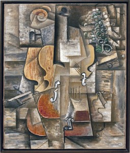
Picasso’s Violin and Grapes (Photo courtesy of Ahisgett)
When my brother Graham was in kindergarten, he learned a little bit about Pablo Picasso. And so my mother decided to take the whole family to a touring Picasso exhibit at the Smithsonian, which featured five or so of his paintings, including some of his most famous examples of cubism.
My brother is a man of few words, and he wasn’t any different as a little boy. He quietly walked around the paintings, looking intently at them and being careful not to cross the red velvet ropes that kept out curious hands. Nearby, we were all watching Graham, wondering what in the world he was thinking.
That’s when he stepped back from one of the paintings and said, “Oh, I get it.” We waited for something insightful. He pointed to the velvet ropes and said: “The paint is still wet.”
Cubism is not the easiest kind of art to understand. But you have to admit — whether you like it or not — cubism catches the eye.
[laurabooks]
In cubism, objects are deconstructed, analyzed and reassembled — but not necessarily in their original order or size. When this is done in painting, the result is a three-dimensional object reassembled in a two-dimensional space, without regard to what can actually be seen in the real world. So while you can’t see the back of a violin when you’re looking at the front, Picasso may depict the back and front at the same time in the same two-dimensional space.
Freaky, right?
I’ll leave it to the art experts to explain why this works. But I can talk a bit about the
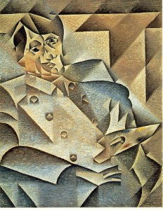
Portrait of Pablo Picasso by Juan Gris (Photo courtesy of Raxenne)
the geometry of cubism.
First, you need to know that cubism has its roots in the work of Paul Cezanne. He began playing with realism, saying he wanted to “treat nature by the cylinder, the sphere, the cone.” In other words, he began replicating these figures as he saw them in his subjects.
Henri Matisse, Picasso, and others took Cezanne’s approach even further. It’s not hard to recognize the cubes and angles and spheres and cones. But it’s the flattening of three-dimensional space and disregard of symmetry that really distinguishes cubism from realism or impressionism.
Symmetry is a very common occurrence in mathematics. From symmetric shapes to the symmetry of an equation (remember: what you do to one side of an equation, you must do to the other!), it’s fair to say that when symmetry is absent, it’s a big deal.
And the same is true for nature, the most often referenced subjects in art. A face, a water lily, the body, a beetle — you could spend all day finding symmetry in the natural world. Cubism turns this notion on its head.
And still, the pieces are compelling. It’s that dissonance that draws our attention and even illustrates difficult subjects. (Picasso’s most enduring and controversial pieces is Guernica, a large painting depicting the Nazi bombing of a small Spanish town.) The artists do this by breaking traditional rules and ignoring some mathematical truths.
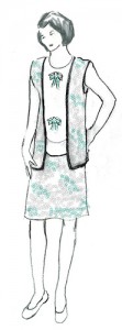
My middle school daughter aspires to be a fashion designer, and so she’s been concentrating lately on learning to draw female human figures. Last Friday, she came home from school and immediately logged on to the internet in search of a “how to draw” tutorial. She spent the next several hours engrossed in aYouTube video that not only demonstrated how to draw the ideal human figure but offered some interesting tricks of the trade. For example:
The ideal figure is eight heads tall.
The width of this figure’s shoulders is typically two heads — arranged horizontally — wide.
The width of this figure’s hips is typically two heads — arranged vertically — wide.
The top of this figure’s inseam (or the “bend” of the figure) is four heads tall or half a person’s height.
That’s right! Your own body can be sketched based on the size of your head!
What does it have to do with math? This approach to drawing is based on proportions, and it depends on a relative unit. In other words, the entire figure can be drawn based on one relative measurement — the size of the figure’s head.
(Here’s an interesting video that shows how to draw these figures by first folding the page in half longways and then in eighths along the short side. Great use of proportions!)
This approach allows great flexibility. For example, men are typically taller than women, but their heads are also typically larger. Therefore, the unit for a male figure will probably be bigger than a unit for a female figure.
In addition, artists can use this one unit to draw figures of varying sizes — tiny in one drawing or huge in a large-scale piece — simply based on this one unit. All they need to do is draw the head first.
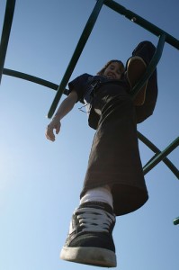
This photograph demonstrates foreshortening. Notice how the angle of the shot makes the feet seem much larger than the head. (Photo courtesy of hunnnterrr.)
It’s important to note that no one has a perfectly proportioned body. Some people may be only 7.5 heads tall. Or perhaps their legs are not half their height. Or maybe they have a long waist. And the angle at which a figure is positioned will affect these proportions. Objects that are closer seem larger, while objects that are farther away seem smaller. This is called foreshortening.
And of course anything can be used as the unit measure. Have you ever seen an artist look at her subject over an outstretched brush or pencil? This is a common method of measuring the figure from that particular angle. An artist using the photograph to the left might notice, for example, that the subject’s right foot is three heads high.
The pencil or brush can also be useful in determining angles. Two pencils can be held up to form the angle made by the figure’s arm and torso and then checked against that angle in the drawing.
All of these techniques are based on the properties of similar figures. If two figures are similar, they have the same shape, but are proportional in size. Remember your geometry class, when you proved that two triangles were similar, using the SSS, SAS and ASA similarity theorems for triangles? (If not, don’t worry.) They boil down to one important fact: all of the corresponding sides of similar figures are proportional, while all of the angles of those figures are the same measure.
But here’s the thing: artists probably don’t think too much about that. My daughter hasn’t even studied similarity yet, but she’s able to figure out how to draw a human figure. Once again, we’re using math without knowing the reasons behind it. And that’s okay. It’s enough to know that it’s there.
Do you draw? Have you attempted to learn to draw but not understood how to get the proportions right? Does having some of these rules help?
In my interview with painter, Samantha Hand, she mentioned something called the Rule of Thirds. I’ve heard of this, but I honestly had no idea what it was about.
Turns out the Rule of Thirds isn’t really about thirds, per se. Instead it’s about ninths. The idea is to divide the image into nine equal parts — something like this (Photo Credit: Lachlan via Compfightcc):
There are a couple of things to notice here. First there are exactly nine rectangles inside the one rectangle — forming a 3 x 3 grid. Second, all of the smaller rectangles are congruent, which just means they are the same size and shape. Last, each of the smaller rectangles is proportional to the larger rectangle.
What does this proportional thing mean? It’s simple, but let me explain using some numbers. Let’s say that the photo to the left measures 12 in by 6 in. (It probably doesn’t but stay with me.) From that information, we can determine the dimensions of the smaller rectangles: 12 in ÷ 3 = 4 in and 6 in ÷ 3 = 2 in. So each of the smaller rectangles is 4 in by 2 in.
If the small and large rectangles are proportional, they’ll have the same ratio. Let’s take a look:
12/6 = 2
4/2 = 2
This ratio that they have in common has a fancy name: the scale factor. (And if you know anything about drafting or making scale models, that will be familiar.)
Now before we get too far into this, let me say that Samantha — and most painters and photographers who might use the Rule of Thirds — isn’t thinking about proportion and scale factor. But this a good example of when proportions are important andintuitive.
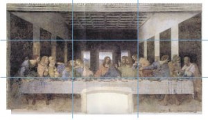
So getting back to the Rule of Thirds — according to some research, people’s eyes are naturally drawn to where the grid lines intersect. A painter can use this information to draw viewers into the painting, especially if there are surprising elements or those that should have more emphasis. Take a look at Da Vinci’s The Last Supper.
Image courtesy of Atelier Mends
Notice how the table itself sits along the bottom horizontal line. The left vertical line crosses Judas, Peter and John, and the right vertical line crosses Thomas, James and Philip. Interestingly, the greatest tension in the piece is at these two points, while Jesus occupies the exact center of the painting with a calm demeanor. Whatever your religious beliefs are, the story this painting tells is furthered by Da Vinci’s use of the Rule of Thirds.
In a couple of weeks, you’ll meet a photographer who probably also uses the Rule of Thirds in her work. In the meantime, see if you can superimpose an imaginary 3 by 3 grid over your favorite paintings or photographs. How does the Rule of Thirds draw you into the piece? How does it help you notice important or surprising details?
Have you noticed the Rule of Thirds in paintings that you love? Share your thoughts in the comments section!
On Monday, I introduced you to Elizabeth Perkins, an up-and-coming glass artist in Seattle. (She also happens to be one of my former students, but that is mere coincidence. I take no credit whatsoever for her success and talent.) In her interview, she mentioned that she depends on the Fibonacci sequence to develop some of her annealing programs, or processes for cooling the glass so that is remains structurally sound.
But what the heck is a Fibonacci sequence?
Well, it’s a pretty cool list of numbers. And it’s also really, really easy to figure out. See for yourself:
0, 1, 1, 2, 3, 5, 8, 13, 21, ?
What’s the next number?
I’ll give you a chance to think about it.
Need a hint? Pick any number in the list (except for the first 0 and first 1), and look at the two numbers before it.
Get it yet? (The correct answer is 34.)
The Fibonacci sequence is generated by adding the last two numbers together to get the next number. Take a look:
0 + 1 = 1
1 + 1 = 2
1 + 2 = 3
2 + 3 = 5
3 + 5 = 8
5 + 8 = 13
8 + 13 = 21
13 + 21 = 34
Now that you know this rule, you could conceivably add numbers to this sequence until you got bored or exhausted (which ever comes first).
The fellow who discovered this sequence was, you guessed it, Fibonacci — an Italian mathematician and philosopher who was reportedly born in 1175 AD. But to be honest, his sequence is not the greatest contribution Fibonacci (or Leonardo de Pisa) gave to humankind. In fact, he is the father of our decimal system. Yep, the fact that you can count the $5.23 you have in your wallet is due to a guy whose real name we don’t even know for sure.
But I digress.
The Fibonacci sequence isn’t just an easy and cool math fact. It’s cool — and really, really important — because it shows up everywhere. Here are just a few examples:
If you count the petals of various species of daisies, you’ll get one of the Fibonacci numbers.
The length of the bones in your wrist and hand are a Fibonacci sequence.
The spiral of a pineapple is arranged in Fibonacci numbers.
Branches of a tree grow in a Fibonacci sequence (one branch, two branches, three branches, five branches, and so on, moving up the height of the tree).
The gender of bees in reproduction mirrors the Fibonacci sequence.
Photo courtesy of Mr. Velocipede
And then there’s art. Art loves the Fibonacci sequence. Since the Greeks formalized what is beautiful in architecture and paintings, this little list of numbers has been front and center in a variety of artistic fields.
For example, this seven plate print is gorgeous and also represents something called the golden spiral. The sides of each square (starting in the center with the smallest squares) correlate to the numbers in the Fibonacci sequence. So, the smallest square has side length of 1 unit, the next largest is 2 units, the next is 3 units, the next is 5 units, etc.
Cool huh?
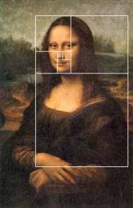
It gets better. Remember the lady with the mysterious smile? Leonardo da Vinci was fascinated by mathematics, and some folks have noticed that his lovely lady’s facial characteristics follow the path of the Fibonacci sequence.
Image courtesy of www.shoshone.k12.id.us
Do you see how the squares line up with the base of her eyes and bottom of her chin, and surround her nose perfectly?
So there you have it. What we see as beautiful could very well be because of mathematical wonders like Fibonacci’s sequence. And as Beth the glass blower shows, this magical little list of numbers is useful in the science of making art as well.
Earlier this year, I posted a really, really cool video about the Fibonacci sequence in nature. Check it out here.Save
Last night, my family and I had a real treat. In the midst of an impossibly busy week, we took time out to sit in a darkened theatre and be transported to another land and another time. As the lights dimmed and the orchestra swelled, we were suddenly in 1905 Russia, with Tevye, his wife Golde and their five daughters. The man sitting next to me hummed along with every song, and I mouthed the words. Like much of the rest of the audience, I found myself grinning at Tevys’s dancing–and crying when he declared his daughter, Chava, dead to him.
*sigh*
This morning, the tunes from Fiddler on the Roof are still running through my head. For me, there’s not much more inspiring and beautiful than a staged musical.
One my family’s resolutions this year is to see more theatre. And we’ve made good on that promise already. In January, we saw Arsenic and Old Lace and a community college production ofGreater Tuna. I’m not sure what’s next.
Like many folks, I believe art (of all kinds) provides the gorgeous background to a sometimes drab world. Art makes me think, while invoking emotions that can be otherwise hard to access. I’ve found myself moved by Pyotr Ilyich Tchaikovsky, Martha Graham, Edgar Degas, Mary Oliver, Amy Ray and Oscar Wilde. Art has become a centerpiece of my daily life.
But if you grew up thinking that art and mathematics were mutually exclusive entities, I hope you’ve been disabused of that notion. If not, stay tuned.
Here at Math for Grownups, February is all about art. I’ll introduce you to some amazing artists — like Elizabeth Perkins, one of my former math students, who is now a highly conceptual glass artist. These creative souls will help make the connections between art and math.
And we’ll delve into some of the more esoteric aspects of mathematics that form the underpinnings of natural beauty, classic art and modern music–like symmetry, the golden ratioand Fibonacci’s Sequence.
If art provides the beauty of the world, math describes it. From poetry to glass sculptures to song, math is at the heart of all artistic endeavors. I hope you’ll join me this month as we uncover the beauty of the world around us–with math.
What is your favorite artistic form? Music, paintings, theatre, writing? Share your thoughts about math and art in the comments section below. And if you’ve always had a question about the connections between art and math, ask. I’d love to explore the answer in a post this month.Save
This Forever 21 shirt is no longer available. (Thank goodness!)
Forever 21 and J.C. Penny had problems with moms and teen girls, when they retailed their own versions of math-as-gender-warfare–t-shirts that read: Allergic to Algebra and I’m Too Pretty for Homework, So My Brother Does It for Me. Within days, the shirts disappeared from the shelves and their websites.
I wrote a guest blog post about this for Dara Chadwick’s wonderful blog You’d Be So Pretty If, which is devoted to encouraging positive body image in girls.
I was a great high school student. I did well in all of my classes (Okay, so I did fail band that one grading period because I didn’t turn in my practice sheets.). I was a responsible and eager student. But there was one subject that was a challenge for me: French.
I tried. I really did. But for whatever reason, the most romantic of all of the romance languages did not come easy. I had good teachers. I studied. I paid attention in class. But the best I could do was a low B — and that was with a lot of hard work.
Still, I didn’t have a t-shirt that read, “French Phobic.” I’ve never heard of a Barbie doll that says, “French is Hard!”
So what’s the deal with math?
Math is hard. But so is writing, reading, playing an instrument, painting, soccer, woodshop and, yes, French. In fact, if teachers and coaches are doing their jobs, students will feel challenged — which can bring up a variety of other feelings, from frustration to enthusiasm.
You’d Be So Pretty If… by Dara Chadwick.
Read the rest here, and be sure to comment. Also, check our Dara’s wonderful book You’d Be So Pretty If…Anyone who knows a teenage girl should!
So what do you think about these t-shirts? Are they all in fun or bad for girls? Why does math get such a bad rap? Share your ideas in the comments section.
Today, I’m guest posting at Math Boot Camps, a blog designed for high school and college students who are taking upper-level math classes. Take a look!
Everyone who has studied math has felt overwhelmed, confused, and downright frustrated at one time or another. The real stuff starts to happen when you decide how you are going to handle it. Are you going to give up and try to avoid it all as much as possible or learn to adjust a bit? (It’s kind of like working out hard – hey, everyone gets sore sometimes but that doesn’t mean you stop!)
In her quest to convince me that math is a stupid subject, my daughter started playing a little game with me last year. She really thought she could come up with something that doesn’t have to do with math. For a couple of days, she shouted words at me — like “flowers,” “air,” “water,” “running” — and I easily explained how math was important in each one.
That’s when we first started talking about the Fibonacci Sequence, which is nothing more than a sequence of numbers that go on forever and ever: 1, 1, 2, 3, 5, 8, 13, 21, … If you look at the sequence carefully, you can guess what the next numbers are. But did you know that the Fibonacci Sequence is found everywhere in nature?
This video is a really cool look at this phenomenon, as well as other applications of math in nature. And you don’t need to understand the math to appreciate the beauty. Just take a look and enjoy.
What math did you recognize, if any, in the video? Anything in particular you found interesting or beautiful? Share in the comments section.
One of the complaints I’ve heard about Math for Grownupsis that it only covers basic math. And I’m not apologetic about that. The whole point of the book is to make basic math a little less mysterious and a little more practical.
But there may be times when you need an Algebra II refresher or review of basic calculus facts. If we don’t use this stuff we lose it.
Throughout the years, I’ve discovered a few really wonderful websites that offer just this kind of assistance. From explaining basic math in theoretic terms (which may be necessary to help our kids with their middle school math homework) to reviewing more complex math topics, these sites are really wonderful. When you need a little more than the basics, I recommend taking a look.
This site offers a wide variety of resources for parents, teachers and students. But the part I love the most is Ask Dr Math. Hundreds of college professors answer math-related questions from students, teachers and parents around the world. These responses are archived in a searchable database. Plus there are broad categories to browse, like Formulas and Middle School.
This site is devoted to algebra–from absolute value to solving systems of linear equations. Students (and parents) can skim lessons for quick answers or read them carefully for more in-depth review of the topics. You can also post a question in the forums and receive a thoughtful response that invites you to think critically or refers you back to the lessons themselves. (There are no quick answers here!)
Have you forgotten what a Cartesian plane is? Are you wracking your brain trying to remember why the y-intercept is a big deal? Mathwords offers definitions for thousands of math terms. There are no examples or explanations here, but sometimes knowing a definition is enough to jog the old synapses. Right?
Do you have any favorite math resources? Share them in the comments section!
Raise your hand if you’ve heard of M.C. Escher. Now raise your hand if you know what tessellations are.
Surprise! If you know of M.S. Escher’s work, you are also familiar with tessellations — even if you don’t recognize the term. In fact, if you have or have seen a tiled floor, tessellations are familiar to you.
A tessellation is a pattern of identical, interlocking shapes. There can be no space between the shapes and none of the shapes can overlap. Escher created complex tessellations of birds, lizards and fish. But even simple, square tiles are tessellations.
This video shows how they are made. Don’t watch it expecting a tutorial. Just look at how the shapes are formed and then replicated and rotated to form the tessellation. A design like this one is pretty complex, but it’s interesting to see it in motion.
(There is no sound with this video, so there’s no need to crank up your speakers.)
Bonus! I found this really great video that shows how to make a tessellation. Check it out.
Where have you seen tessellations? When do you think they’re useful or interesting to see? Leave your comment!


