Categories
Math for Grownups Statistics

Math and Cancer and Feelings: Or, where the heck have I been?

No. I do not have cancer. But in April and May and June of this year, I thought I might.

So that’s the answer to the question in my headline. I’ve been taking a break while I deal with the roller coaster of emotions that come with suspicious mammogram and biopsy results and then surgery. First, the story.

In April, I had an ordinary, run-of-the-mill mammogram. I’m what you call a non-compliant patient, and so I’ve only had one other mammogram in my life. Turns out both of these great experiences ended up with biopsies. My first feeling was to be totally pissed off. I’d had a biopsy before, and let me tell you, they are not fun. And since the first one showed nothing, I expected that this would be more of the same — an exceedingly uncomfortable and nerve-wracking experience that showed nothing.

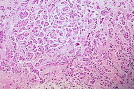
Except it didn’t. The biopsy showed “atypical” cells. This means I had something called Atypical Ductal Hyperplasia or ADH. This is not cancer. These atypical cells cannot even be called precancerous cells. My amazing surgeon explained: Research shows that women with ADH have an increased chance of those atypical cells becoming cancer. Here are the numbers:

  • Women without ADH have about a 5 percent chance of getting breast cancer.
  • Women with ADH have a 20 percent chance of getting breast cancer.
  • And that means women with ADH have four times the chance of getting breast cancer.

For me, those numbers pointed to a very easy decision: to have the area with ADH removed. On July 5, I had a lumpectomy. Then I waited for the pathology results. I waited for 10 days.

Anyone who has gone through something similar knows the special hell these ten days were. I am not a particularly emotional person. And yet, these ten days were downright terrifying. And here’s why.

There was a 20 percent chance that the lumpectomy would reveal cancer. In other words, there was a slight chance that the biopsy missed any cancerous cells that were already there. Of course, that meant I had an 80 percent chance of no cancer at all.

After the surgery, I updated my friends and family. One physician friend emailed me back: “I hope you find some solace in those stats (ie the 80%).” I assured her that I did. (No lie at that point.) And she followed up with this:

“Glad to hear how you’re taking it. You are right about the stats.  They are often very difficult for patients, because if there is a small chance of something, but a patient has it, that patient has 100% chance of having it, right? But we as physicians use stats all the time, especially in the office setting where you don’t have any and every diagnostic test at your fingertips, and with the cost– psychological and financial– to the patient: what is the chance that this patient with this headache and those symptoms has a brain tumor? What are the chances that this person’s chest pain is a heart attack and not indigestion? It is probability, given symptoms, age, and a slew of other factors, in combination with the implications of a given diagnosis.”

These numbers were supposed to ease my mind. Except feelings + stats + time = complete and utter freak out.

By day nine of my waiting period, I was a total wreck. I cried all day long. I wasn’t sure if I was going to be able to sleep. I was nervous as a long-tailed cat in a room full of rocking chairs.

Happy ending: I don’t have cancer. I know that not everyone gets that amazing news, and I am extremely grateful. I am being followed very closely, because my chances of getting breast cancer are still higher than most women’s. And I’m taking tamoxifen for the next five years, which reduces my chances by half. Those aren’t bad stats either.

I never thought that math was the be all end all, but I have often railed against misinterpreting numbers to incite fears and advocated for the use of statistics to ease worry. Still, feelings don’t always play well with math, I’ve found. When a person is worried — scared, even — a pretty percentage may not be comforting. And that’s okay, too. We all do the best we can with what we’ve got.

What’s your story with health and statistics? Has a percentage ever frightened you to the point of distraction or temporary insanity? Share your story here. You are not alone!

Categories
Math for Grownups Math for Teachers Math for Writers Statistics

That’s So Random: Getting sampling right

On Wednesday, we talked about sample bias, or ways to really screw up the results of a survey or study. So how can researchers avoid this problem? By being random.

There are several kinds of samples from simple random samples to convenience samples, and the type that is chosen determines the reliability of the data. The more random the selection of samples, the more reliable the results. Here’s a run down of several different types:

Simple Random Sample: The most reliable option, the simple random sample works well because each member of the population has the same chance of being selected. There are several different ways to select the sample — from a lottery to a number table to computer-generated values. The values can be replaced for a second possible selection or each selection can be held out, so that there are no duplicate selections.

Stratified Sample: In some cases it makes sense to divide the population into subgroups and then conduct a random sample of each subgroup. This method helps researchers highlight a particular subgroup in a sample, which can be useful when observing the relationship between two or more subgroups. The number of members selected from each subgroup must match that subgroup’s representation in the larger population.

What the heck does that mean? Let’s say a researcher is studying glaucoma progression and eye color. If 25% of the population has blue eyes, 25% of the sample must also. If 40% of the population has brown eyes, so must 40% of the sample. Otherwise, the conclusions may be unreliable, because the samples do not reflect the entire population.

Then there are the samples that don’t provide such reliable results:

Quota Sample: In this scenario, the researcher deliberately sets a quota for a certain strata. When done honestly, this allows for representation of minority groups of the population.  But it does mean that the sample is no longer random. For example, if you wanted to know how elementary-school teachers feel about a new dress code developed by the school district, a random sample may not include any male teachers, because there are so few of them. However, requiring that a certain number of male teachers be included in the sample insures that male teachers are represented — even though the sample is no longer random.

Purposeful Sample: When it’s difficult to identify members of a population, researchers may include any member who is available. And when those already selected for the sample recommend other members, this is called a Snowball Sample. While this type is not random, it is a way to look at more invisible issues, including sexual assault and illness.

Convenience Sample: When you’re looking for quick and dirty, a convenience sample is it. Remember when survey companies stalked folks at the mall? That’s a convenience or accidental sample. These depend on someone being at the right (wrong?) place at the right (wrong?) time. When people volunteer for a sample, that’s also a convenience sample.

So whenever you’re looking at data, consider how the sample was formed. If the results look funny, it could be because the sample was off.

On Monday, I’ll tackle sample size (something that I had hoped to include today, but didn’t get to). Meantime, if you have questions about how sampling is done, ask away!

Categories
Math for Grownups Math for Teachers Math for Writers Statistics

One in a Million: How sample bias affects data

Continuing with our review of basic math skills, let’s take a little look-see at statistics. This field is not only vast (and confusing for many folks) but also hugely important in our daily lives. Just about every single thing we do has some sort of relationship to statistics — from watching television to buying a car to supporting a political candidate to making medical decisions. Like it or not, stats rule our world. Unfortunately, trusting bad data can lead to big problems. 

First some definitions. A population is the entire group that the researchers are interested in. So, if a school system wants to know parents’ attitudes about school starting times, the population would be all parents and caregivers with children who attend school in that district.

sample is a subset of the population. It would be nice to track the viewing habits of every single television viewer, but that’s just not a realistic endeavor. So A.C. Nielsen Co. puts its set-top boxes in a sample of homes. The trick is to be sure that this sample is big enough (more on that Friday) and that its representative.  When samples don’t represent the larger population, the results aren’t worth a darn. Here’s an example:

Ever hear of President Landon? There’s good reason for that. But on Halloween 1936, a Literary Digestpoll predicted that Gov. Alfred Landon of Kansas would defeat President Franklin Delano Roosevelt come November.

And why not? The organization had come to this conclusion based on an enormous sample, mailing out 10 million sample ballots, asking recipients how they planned to vote. In fact, about 1 in 4 Americans had been asked to participate, with stunning results: the magazine predicted that Landon would win 57.1% of the popular vote and an electoral college margin of 370 to 161. The problem? This list was created using registers of telephone numbers, club membership rosters and magazine subscription lists.

Remember, this was 1936, the height of the Great Depression and also long before telephones  and magazine subscriptions became common fixtures in most families. Literary Digest had sampled largely middle- and upper-class voters, which is not at all representative of the larger population.  At the same time, only 2.4 million people actually responded to the survey, just under 25 percent of the original sample size.

On Election day, the American public delivered a scorching defeat to Gov. Landon, who won electoral college votes in Vermont and Maine only. This was also the death knell for Literary Digest, which folded a few years later.

This example neatly describes two forms of sample bias: selection bias and nonresponse bias. Selection bias occurs when there is a flaw in the sample selection process. In order for a statistic to be trustworthy, the sample must be representative of the entire population. For example, conducting a survey of homeowners in one neighborhood cannot represent all homeowners in a city.

Self-selection can also play a role in selection bias. If a poll, survey or study depends solely on participants volunteering on their own, the sample will not necessarily be representative of the entire population. There’s a certain amount of self-selection in any survey, poll or study. But there are ways to minimize the effects of this problem.

Nonresponse bias is related to self-selection. It occurs when people choose not to respond, often because doing so is too difficult. For this reason, mailed surveys are not the best option.  In-person polling has the least risk of nonresponse bias, while telephone carries a slightly higher risk.

If you’re familiar with information technology, you know the old adage: Garbage in, garbage out. This definitely holds true for statistics. And this is precisely why Mark Twain’s characterization of number crunching — “Lies, damned lies and statistics” — is so apropos. When the sample is bad, the results will be too, but that doesn’t stop some from unintentionally or intentionally misleading the public with bad stats. If you plan to make good decisions at any point in your everyday life, well, you’d better be able to cull the lies from the good samples.

If you have questions about sample bias, please ask in the comments section. Meantime, here are the answers to last Wednesday’s practice with percentage change problems: –2%, 7%, –6%, –35%. Friday, we’ll talk about sample size, which (to me) is a magical idea. Really!