In my interview with painter, Samantha Hand, she mentioned something called the Rule of Thirds. I’ve heard of this, but I honestly had no idea what it was about.
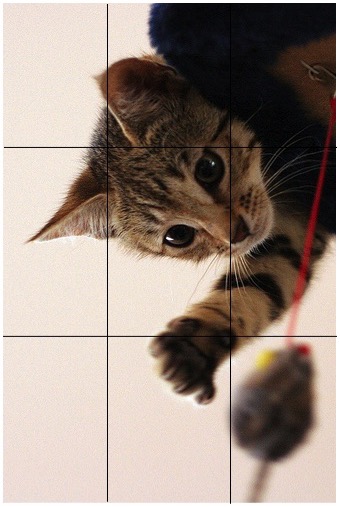
Turns out the Rule of Thirds isn’t really about thirds, per se. Instead it’s about ninths. The idea is to divide the image into nine equal parts — something like this (Photo Credit: Lachlan via Compfight cc):
There are a couple of things to notice here. First there are exactly nine rectangles inside the one rectangle — forming a 3 x 3 grid. Second, all of the smaller rectangles are congruent, which just means they are the same size and shape. Last, each of the smaller rectangles is proportional to the larger rectangle.
What does this proportional thing mean? It’s simple, but let me explain using some numbers. Let’s say that the photo to the left measures 12 in by 6 in. (It probably doesn’t but stay with me.) From that information, we can determine the dimensions of the smaller rectangles: 12 in ÷ 3 = 4 in and 6 in ÷ 3 = 2 in. So each of the smaller rectangles is 4 in by 2 in.
If the small and large rectangles are proportional, they’ll have the same ratio. Let’s take a look:
12/6 = 2
4/2 = 2
This ratio that they have in common has a fancy name: the scale factor. (And if you know anything about drafting or making scale models, that will be familiar.)
Now before we get too far into this, let me say that Samantha — and most painters and photographers who might use the Rule of Thirds — isn’t thinking about proportion and scale factor. But this a good example of when proportions are important and intuitive.
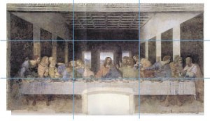
So getting back to the Rule of Thirds — according to some research, people’s eyes are naturally drawn to where the grid lines intersect. A painter can use this information to draw viewers into the painting, especially if there are surprising elements or those that should have more emphasis. Take a look at Da Vinci’s The Last Supper.
Image courtesy of Atelier Mends
Notice how the table itself sits along the bottom horizontal line. The left vertical line crosses Judas, Peter and John, and the right vertical line crosses Thomas, James and Philip. Interestingly, the greatest tension in the piece is at these two points, while Jesus occupies the exact center of the painting with a calm demeanor. Whatever your religious beliefs are, the story this painting tells is furthered by Da Vinci’s use of the Rule of Thirds.
In a couple of weeks, you’ll meet a photographer who probably also uses the Rule of Thirds in her work. In the meantime, see if you can superimpose an imaginary 3 by 3 grid over your favorite paintings or photographs. How does the Rule of Thirds draw you into the piece? How does it help you notice important or surprising details?
Have you noticed the Rule of Thirds in paintings that you love? Share your thoughts in the comments section!

