In our interview on Monday, professional photographer Sally Wiener Grotta talked about using histograms to help determine the exposure she needs to best reflect her subject in a photograph. If you took any statistics in high school or college — or have helped a middle schooler with her math homework — you may know exactly what a histogram is. But do you understand how these graphs are helpful for photography?
In short, a histogram is a graph that demonstrates variance and frequency. (Stay with me here. I know there are some strange, mathy words in there.) Here’s a really simple example:
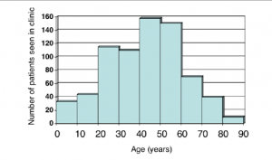
The administrators of a health clinic are collecting data about the patients, so that they can provide the most appropriate services. The histogram below shows the ages of the patients.
Even with one quick glance, it’s apparent that the clinic sees far fewer patients who are between 80 and 90 years old. In fact, it looks like the group that’s most represented includes those between 40 and 50 years old.
(If you’re really being a smarty pants, you might notice that the histogram follows the normal or bell curve. But you don’t have to know that to get along in everyday life — unless you work in statistical analysis.)
So here’s what’s special about a histogram:
1. The horizontal line (or axis) represents the categories (or bins). These are almost always numbers, and each one has no gaps. In other words, in a histogram, you won’t have categorical data, like people’s names. Notice also that the data is continuous. Someone who is 43 and 5 months falls in the 40-50 year old category.
2. The vertical line (or axis) represents the frequency or count of each category. These are always numbers. So in the histogram above, 40 people who visited the clinic were between 80 and 90 years old.
3. The bars of the histogram butt up against one another. That demonstrates the fact that there are no gaps in the data and the data is numerical.
4. The taller the bar, the more values there are in that category. The shorter the bar, the fewer values there are in that category.
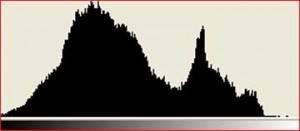
So let’s look at a photographer’s histogram:
First off, these histograms are automatically generated by imaging software or even some fancy-schmancy cameras. In other words, technology plots these values. It’s the photographer’s job to interpret them.
You probably noticed that there are no numbers on this histogram. Like a statistical histogram, the vertical axis represents frequency. But the horizontal axis doesn’t represent numbers. Instead, it shows shades. Follow the bar at the bottom of the histogram from the left to the right. Notice how it goes from black to grey to white? In fact, the bar gradually changes from black to white.
If you could blow up this histogram to a much larger size, you would see that it’s made up of lots and lots of skinny rectangles. These represent the number of pixels in the photograph that are each shade. So there are very few (if any) pure white pixels. There are some pure black pixels, but not as many as there are grey ones.
By glancing at this image, an experienced photographer can determine whether an image needs more or less exposure. There’s a great deal of artistry in this — a really dark photo can have a dramatic effect, while certain conditions require more exposure than others.
There you have it. Histograms aren’t just for statisticians. And those silly little graphs you drew in your middle school math class actually have artistic value!
Do you have questions about histograms? Ask them in the comments section!


